


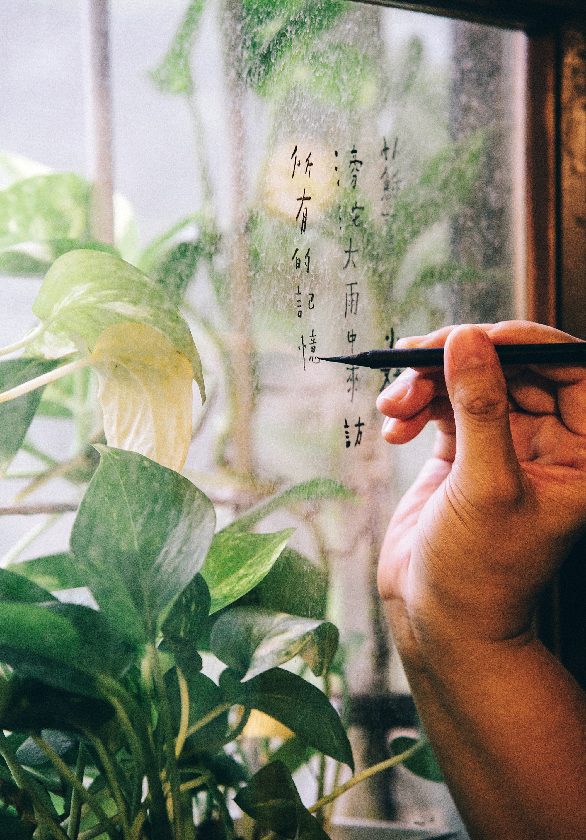
Ho Ching Chwang’s calligraphy exemplifies the possibilities and charm of a new style of calligraphy. (photo by Lin Min-hsuan)
|
|
What others see as a word, a calligrapher or designer might see as a picture. Because of the unique structure of Chinese characters, the character as a visual element often opens up greater possibilities of expression for calligraphers and designers.
“I’m not saying that I don’t like the fundamental principles of calligraphy, but I’m much more interested in the composition of the word as a picture,” says Ho Ching Chwang, a calligrapher.
“My conception of the written word is a pictographic meditation,” says Kao I-min, founder of TaiwanLIKE. “All words to me are visual elements.”
“I see words as pictures, and pictures as words,” says Kokia Lin, CEO of I-Am Brand Design.
So, how will Chinese characters be playfully transformed into a new visual landscape in the hands of these artists and designers?
The new face of contemporary calligraphy
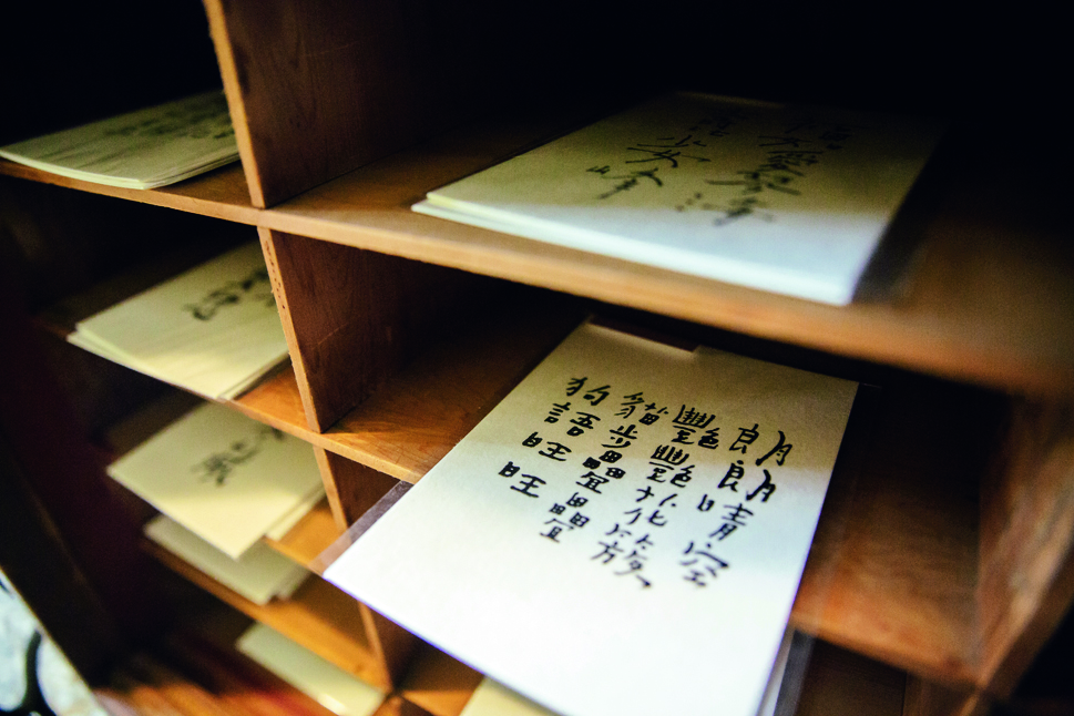
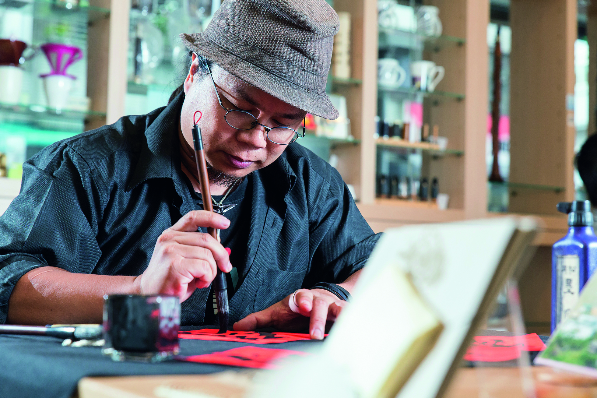
When people first see Ho Ching Chwang’s calligraphy, they typically come away with a profound impression of her innovative style, marked by slender, gangling strokes. Many people know her work through her calligraphic postcards decorated with playful variations on Chinese sayings, such as mao fei jia run—“may your cat be fat and your home be rich”; you tusi you cai—“to have toast is to be rich” instead of you tu si you cai—“to have land is to be rich”; or fu bi Aiqin Hai, shou bi Shaonü Feng—“may your happiness be as boundless as the Aegean Sea, may you be as long-lived as the Jungfrau” instead of the traditional birthday greeting fu bi Dong Hai, shou bi Nan Shan—“may your happiness be as boundless as the Eastern Sea, may you be as long-lived as the Southern Mountains.” These childlike verses rarely fail to delight. Combining her keen observation of life’s textures with her original calligraphic style and her sense of humor, Ho has created the highly distinctive “Ho Ching Chwang script.”
Inspired by a work of Taiwanese calligrapher Grace Tong, Ho took up the brush herself, but she did not take the conventional route toward the study of calligraphy. She abandoned standardized calligraphic styles, such as the seal script (zhuanshu), clerical script (lishu), standard script (kaishu), and semi-cursive script (xingshu). Instead she took an unconventional path focusing on the composition of the characters. But just how did she establish her personal style? “I just created my own content,” she says.
|
|
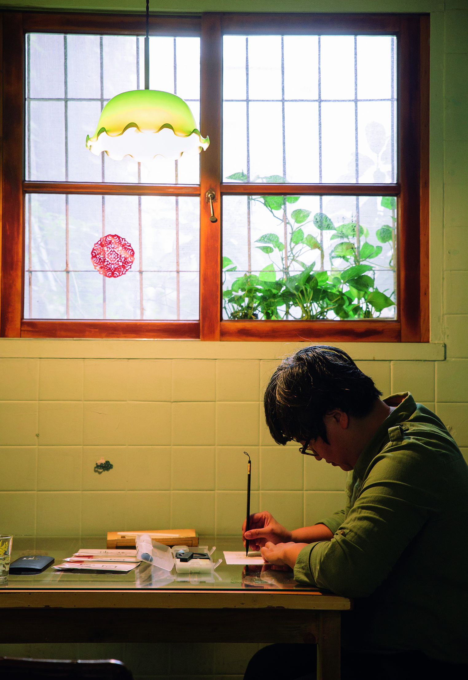
About ten years ago when Ho was living in London, the exchange rate was approaching NT$70 to the pound sterling, resulting in exorbitant prices and making her treasure each experience in her daily life. It was at this time that she began to integrate calligraphy into her own artistic works. Rather than copying out traditional works for practice, Ho copied contemporary poetry, essays, and even newspaper articles in order to make her work more relevant to contemporary life. Traditional calligraphy emphasizes seclusion and meditation, but Ho preferred to pack up a calligraphy set—paper, ink, brush, and ink stone—and practice in noisy coffee shops as the mood struck her. And unlike most artists who prefer to exhibit in museums and galleries, Ho generally shows her work in restaurants, hotels, college campuses, and other public settings. Ho’s calligraphy exemplifies the possibilities and charm of a new style of calligraphy.
It is difficult to assess Ho’s calligraphy from a conventional aesthetic viewpoint, yet her work has stimulated interest in calligraphy from a wider audience. Today she continues to cultivate the spirit of “inspirational poetry” and “impromptu exhibiting” that she developed while she was in England, and devotes herself to savoring life’s little moments and capturing them through calligraphy, creating diverse magical scenes using 30 x 30 centimeter sheets of rice paper.
Pictures in words, words in pictures
Turning Chinese characters into images and motifs is a common technique for contemporary designers. In fact the practice has a long history. Characters were used as inscriptions and in slightly altered forms inscribed on utensils and various architectural structures by traditional craftsmen.
“Western design also uses words and letters as design elements, but many Chinese characters are pictographs, and so when used as an image their meaning is more profound and more easily conveyed. They therefore have an even greater expressive power when used as elements for visual communication,” says Hugh Hu, general manager of NDD Design and former curator of the Delight of Chinese Characters Festival held in Kaohsiung.
When a friend of Kao I-min’s was traveling abroad and wanted an easily recognizable symbol of Taiwan, Kao combined the two characters in the word “Taiwan” with the shape of the island. This became the starting point for his brand TaiwanLIKE.
|
|
“What TaiwanLIKE sells are products with cultural significance. The question for us is how we can help people to better understand this place called Taiwan,” says Kao. He believes that on this ethnically diverse island, living beings must overcome division and present the outside world with a unified image. He therefore uses the TaiwanLIKE logo and transforms it into images of a crow butterfly, a black-faced spoonbill, local banana varieties, the lotus, and other typically Taiwanese animals and plants, and then develops them into products such as luggage stickers, postcards, accessories, and t-shirts. This allows customers to take a bit of Taiwan on their travels and spark the curiosity of other people who can then become better acquainted with Taiwan.
Kao makes use of his design techniques both to extract images from text and to distill meaning from narration in order to create products and product names. For example, he transformed the shapes of milkfish bones into a line of silver accessories, which he calls “The Moment.” The line’s Chinese name, jieguyan, is an idiomatic phrase meaning “a crucial moment,” with a literal meaning that refers to bones. Kao used the three characters of the name to create a composite logo in which two of the characters are fused together by sharing a common element. The strokes of the characters also mimic the shapes of fish bones.
By using the imaginative potential of images and a solid foundation in Chinese culture, Kao has turned wordplay into a high art.
Turning words on their heads
Designer Kokia Lin is another outstanding example. The rotated writing system he developed has precedent in ancient culture. Su Hui’s Star Gauge is a poem comprising a grid of shorter poems that was written in the 4th century in the northern Chinese kingdom of the Former Qin. The poems can be read from top to bottom, from bottom to top, from right to left, from left to right, and even diagonally. Lin makes use of optical illusions that allow words to be read in different directions while using two or more scripts, with meanings that connect in astounding ways.
|
|
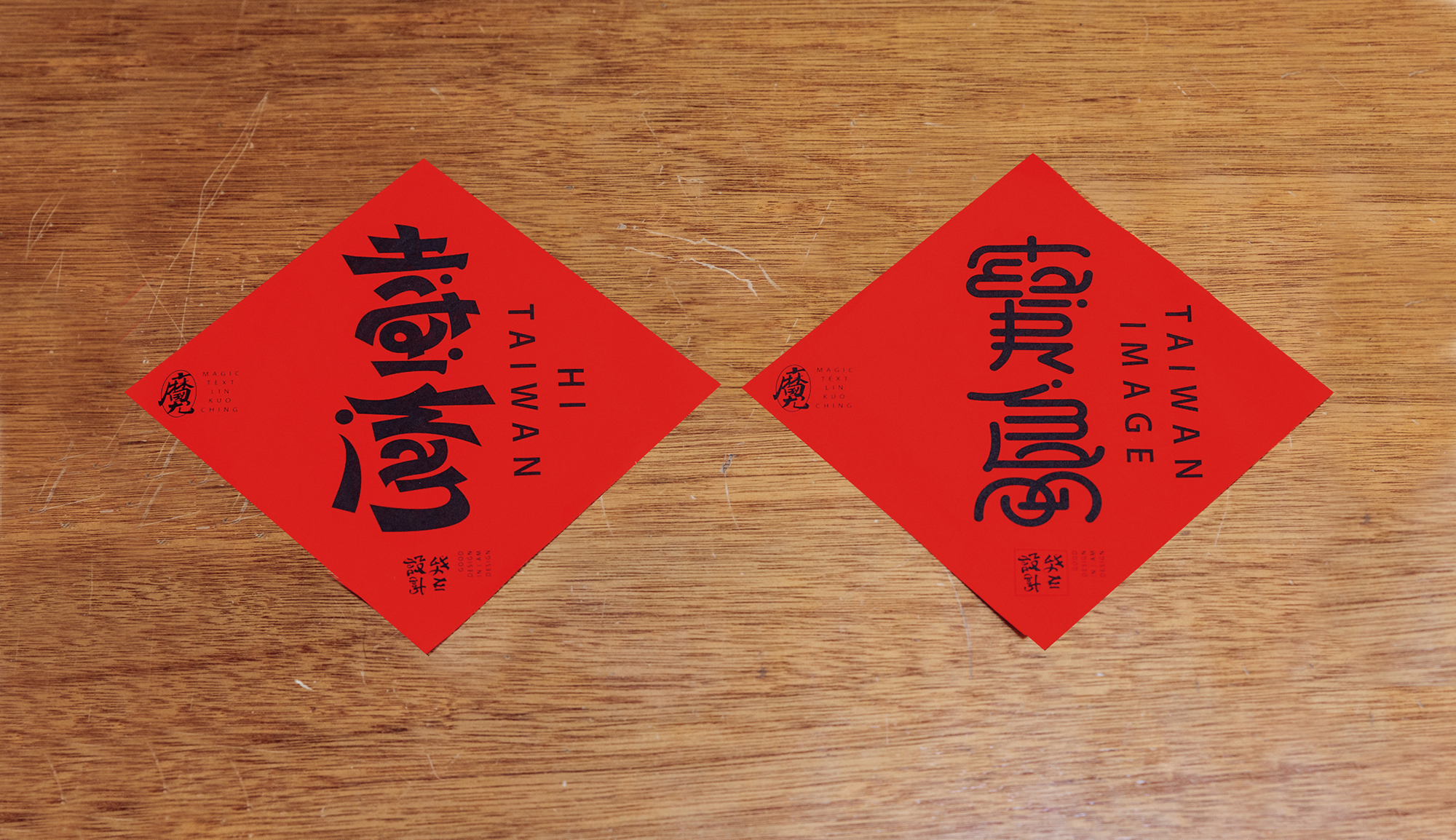
This July iPASS, a stored-value transit card issuer, is releasing a series designed by Lin. His characters for the city name “Tainan” also read “prefectural capital” when turned 90 degrees. The characters for “Kaohsiung” when turned sideways read “dazzling,” which reflects the geography and pace of life of the city. These word puzzles appeal to Taiwanese people and visitors from East Asia whose languages also use Chinese characters. In other examples, the characters for “Taiwan” read sideways read “Hi Taiwan!” in English, and “baodao” (“treasure island,” a phrase often used to refer to Taiwan) can be read sideways as “Taiwan Image.” The characters fu (“good fortune”), lu (“rank”) and shou (“longevity”), meanwhile, can be read as “lucky,” “money,” and “happy,” in a combined Chinese‡English script somewhat reminiscent of the “New English Calligraphy” created by artist Xu Bing, which features English letters written in a Chinese format. Hugh Hu says that Lin “has managed to combine words familiar to Westerners with Chinese fonts, facilitating understanding between the two and creating a bridge between the two languages.”
Artistic fonts are the product of the rise of printing, but the origin remains calligraphy. Although Lin is not a professional calligrapher, he has accumulated years of experience in commercial design creating typographic fonts, preserving the traditions of classical handwritten calligraphy and designing always by hand. As a result he has developed a high degree of sensitivity to Chinese characters and the Latin alphabet, which he can experiment with at will. While his rotated scripts appear at first glance to be solely the product of flashes of inspiration, they actually rely on solid design techniques accumulated over decades.
Lin designed a personal logo from the three characters of his own name, which he combined into a single character resembling the Chinese word for “magic,” mo. He holds words in his hands like a magician, and he is redefining the concept of writing, akin to a modern-day Cang Jie, the legendary creator of Chinese characters.
|
|
A precious cultural asset
In today’s world, in which our clothing, diet, and transportation have all been thoroughly Westernized, the special characteristic of Chinese writing is that it acts as a rare symbol of Chinese culture.
“The use of traditional characters alone allows Taiwan to be a formidable cultural storehouse,” says Hugh Hu. Within the free flow of writing lies the essence of culture and a keen awareness of and respect for the written word.

